
Xing Xiang Rong
Packaging Design
October 2019
Project Brief: Design a new packing for the saffron product to enhance the brand position and showing the brand culture of Buddhism.

"I want a new package for my saffron product. Many of my customers are using it to do grand offering for Budahhas. Therefore, I hope it could show the link to Buddhism but not too obvious that scare other customers..."
"No problem! Any other reason that you want to change a new package? What's the problem with the old one?"
"The old one is a customized product from the factory and it looks so normal among the competitive products. We are selling the top-level products and going to build the brand with a high-end proposition. That's why I think we need a new package... "
By communicating with the client about what did she really want and confirming I'm understanding it right, we go a consensus on the project.
" All right, something that could enhance the brand position with a bit feeling of Buddhism, right? "
Majority packages of saffron
To be outstanding on the market

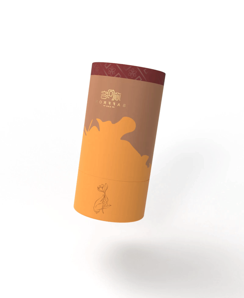
For being recognized and remembered at the first slight, the shape of package is designed as a column.
The column shape links to the unboxing experience of fancy wines or fragrances, which benefits the brand proposition as well.
Design a column package and supporting packages for the saffron with vague Buddhist elements.
Aiming to create a feeling of high-end and culture.
NARROWING DOWN THE
PROJECT BRIEF


Saffron

Buddhism

Pattern Design


The blurred background shape is the layout of saffrons, which is designed to create a strong compare to the repeated patterns in front.

This graphic is inspired by The Implied Meaning of the classic style of Guanyin Holding Lotus in Buddhism paintings.
It shows the religion in a gentle way that doesn't stop people from other religions but also keeps enough Buddhist elements.
VI Colour


The structure of the cylindrical box not only gives the users a refined feeling but also offers extra protection to the bottle by the gap.

The rectangular shape of the handbag links people a feeling to red wine.
There is a little seal sticker located on the top of the handbag, which ensures the security of the products inside the bag while creating a better unboxing experience.
We picked two types of straps that services to a different style that the customers would love to have and fit in different scenarios better.
Diary Handbook
There is a food dairy on one side of the product handbook to create more value for users to use it consistently but not throw away after the first time of reading it.

Thank you for your viewing!
How do you think about adding the feeling of religion into the package? Do you think it will stop some customers? Or attract more customers?
Please be free to leave a comment!
I appreciate any suggestions and your help in supporting me to do a better job!